
Guest 239
-
Posts
613 -
Joined
-
Last visited
-
Days Won
50
Posts posted by Guest 239
-
-
Looks like they're trying to wring the cloth of any additional revenue they can get before EOFY.
-
9 minutes ago, rappa said:
Last thing we want is a 400’ high impression of a kebab shop.
Speak for yourself.
-
 1
1
-
-
16 minutes ago, Slick said:
See? Almost like they knew an upside down M wouldn't work.
Yet it does work. Nobody is confused by the design or wondering what it says. It's clearly 'DREAMWORLD' and whilst it looks odd it's still legible and does the job it set out to do. You're welcome to not like it but again it doesn't make it wrong.
-
2 minutes ago, Slick said:
It's pretty standard for W's to look a certain way. 😂
That's wonderful! Considering you have all day I'd love to the see the standard set for typography on 120m tall black towers within amusement parks.
-
You've subsequently and ironically managed to inadvertently back up my original argument that your statement has no factual basis beyond personal opinion.
That was my entire point in the first place so thank you for doing my job for me.
-
1
-
 1
1
-
-
9 minutes ago, Slick said:
Proceeds to write a condescending lecture based off thoughts on my opinion. Can't have it both ways.
I'm refuting your statement that the design ignores basic graphic design and English language standards. It's not opinion and the statement is simply not true. If you believe being corrected is condescending then I genuinely wish you the best of luck.
-
2 minutes ago, Slick said:
You don't need to form a bad-faith opinion because I said standards instead of semantics - it's so dreary because my opinion doesn't materially change either way.
Ease up for a second champ and actually consider what I wrote. I neither care nor am interested in your opinion. You argued above that Graphic Design and English Language 'standards' were broken with this signage. That's frankly not true, and that's what my comment was about. I would certainly hope that somebody with such a deep understanding of the English language that they use it in the formation of their arguments would understand that standards and conventions are not interchangeable.
People are entitled to their own opinions. If you don't like this then that's fine, but using falsities to back an argument only spreads misinformation through the community for lesser educated individuals and frankly makes you look like an amateur.
-
8 hours ago, Slick said:
I’m sure there was, still doesn’t mean they should ignore pretty basic graphic design and English language standards. W’s just don’t commonly have vertical strokes, which is why it looks weird.
It’s just basic and communicates a lack of detail.
You're confusing convention with standard. There is no absolute rule dictating the specific shape a 'W' must take. However, The design of the 'W' with angled or curved strokes has become the convention in typography. As readers are accustomed to this shape, designers tend to maintain the traditional design to ensure legibility and familiarity.
There are a multitude of reasons why they might have gone down this route such as context-specific use, typography diversity, readability, and artistic expression, but please don't suggest that it's wrong through communicating a lack of detail because it's not.
-
VRTP have recently discontinued many of their old uniforms and replaced them with a simple dark polo and khaki shorts. They've apparently been trialed at Sea World but as of Monday were phased into Movie World as well.
Picture from a recent Theme Park Ogre video that shows the new uniform.
I'm on the fence about them. They look professional and comfortable, but they also look like something I'd expect BOH crew to wear. The teal accents on the old uniform made it obvious as to who you could go to get help where as these blend in a lot more. Thoughts?
-
18 hours ago, GoGoBoy said:
Rare freak accident? I'd say it's actually quite the opposite of that, considering the Malificent dragon in the Disney parade also caught on fire a year or so ago and was covered all over the news
The parade incident was over five years ago. Disney uses pyrotechnics thousands of times a day at a minimum all around the world. This is not a common occurrence.
-
I'm doubtful about the 720pph for the SFC.
The train would need to leave the station every 100 seconds to achieve that. With a 60 second ride time that leaves 40 seconds to cycle guests and check harnesses. If they put AV in the station there is no way they're achieving that. -
4 minutes ago, DaptoFunlandGuy said:
I guess thats one thing both park chains on the GC have in common because the park maps on both sides of the highway suck arse.
This isn't just exclusive to the GC. The user experience for most modern theme parks is terrible. Way too many are to-scale and GPS styled which just don't work for printed guide maps.
In saying that, Dreamworld's map isn't that bad from a user experience perspective. The paths are clear and the landmarks are fairly obvious. It could benefit from some more contrast between accessible and inaccessible areas alongside prominent rides between more exaggerated.
I do agree with @joz that from a design perspective the map looks sparse, but a positive emotional response from a guide map is generally a bonus. The maps primary purpose is to convey information. Disneyland's map is a great example of marrying up great design and user experience.
In regards to the Village vs Dreamworld debate, I think Sea World actually does a great job at marrying these up. On the opposite end Movie World is a perfect example of a design-first approach which makes the park look nice and full whilst being utterly useless as a map.
-
1
-
-
1 hour ago, REGIE said:
Is there any random rides in the middle of the city?
No, there is nothing like Slingshot in the middle of Sydney (because if there was it'd be quickly co-opted by Meriton and turned into boring high-rises.)
Your best bet for attractions in the city are the aforementioned LPS alongside SeaLife, WildLife and Madame Tussaud's alongside the Sydney Tower. Taronga Zoo is also great with some of Australia's best gated theming and atmosphere, but it's a day trip on the ferry to see it all. Otherwise you can also look into the many escape rooms around Sydney CBD. I've personally done a few Mission Escape ones and they're excellent.
-
1
-
-
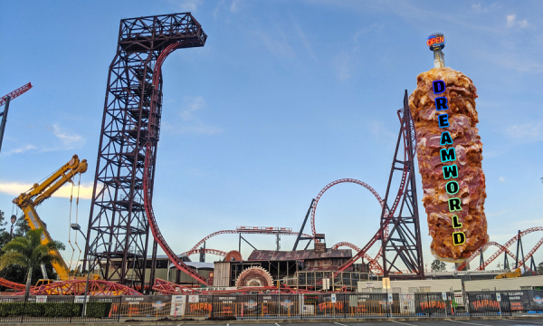
It wouldn't surprise me if the magical floating beam is being managed by somebody else and will have the Dreamworld lettering on it for the globe.
-
Made a little overlay for the plans:
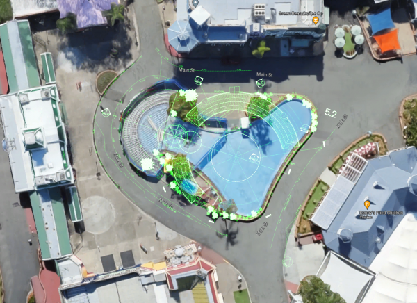
Theoretically it wont take up more space but I can imagine the vertical structures will make the space feel a little tighter.
Something to note is that the best place to see the water features will be from Kenny's and the covered area towards Ocean Parade which is clever considering that where most people are seated for Night Markets.
-
1
-
3
-
-
I really like that. Gives me major RCT vibes
-
Experienced this last weekend. Agree with the above comments. It's nowhere near as polished or grand as the original experience, but it's fine for what it is. My wife really enjoyed it.
On 01/03/2023 at 2:09 PM, Tricoart said:(namely, some Delorean-looking car vanishing from existence in plain sight)
Yeah that was a bit odd. I can only assume that it's an asset left over from another project that they forgot to cull.
-
15 hours ago, New display name said:
I can't get over the texture of this in the photos I've seen of it. It's hard to describe but it feels like if I was to touch it, it'd be 'tacky'. Despite the colour and theme, does it look glossy and finished in real life?
-
3 minutes ago, Gazza said:
Doesn't the Gold Coast already have a flying theatre attraction at Dreamworld?
Let's have two and make them fight to the death for our love.
-
I know, I'm disgusted in myself, but it makes sense from an operational perspective. The park already has a reputation for being gutted and they can't really afford to have this land down for any extended period of time. I'd imagine there are some stipulations from Dreamworks to have any theming connected to their IP removed by X date. This is likely the quick and nasty response to that.
Other than operationally - I don't love it. Like, what's the story here? What are these little things meant to be? I predict that down the line this will likely cause more problems than it immediately solves.
Probably the only reason why I don't despise it is because I have a fondness for the colour blue.
-
2 minutes ago, New display name said:
Let's just paint out the details and nobody will notice a thing.
It's quick and nasty, but it keeps the ride operating. More guests will care about that any additional work they could do here.
-
I've continued tracking uptime data from Sea World since the 19th of January. Here are some stats -
Down Time Percentage
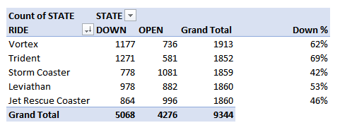
My system tracks three states - CLOSED, DOWN & OPEN. Generally CLOSED is reserved for when the park is shut, but can also be used for down time though it is rare. For simplicity sake on this output I just used my DOWN & OPEN data considering that these states generally need to be assigned manually by the park.
Still, a rough estimate of 30% uptime for a brand new attraction is pathetic. The rest of New Atlantis isn't much better at 38% uptime for Vortex and 47% uptime for Leviathan. I get that there are teething issues, but when your coaster from 2008 is operating more reliably than your coaster from last December than you've got some problems.
Sea World Likelihood Of Down Time
Using this combined data I wanted to see what times of the day rides were most likely to go down.
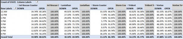
Keep in my mind my data is recorded in Sydney time so 11 AM is 10 AM, etc. With that mind, there are some interesting things to note. Leviathan is more unreliable in the first half of the day and gets more reliable as the day goes on. Storm Coaster is insanely reliable during most of the day. Trident is the opposite of Leviathan and appears to go down more in the afternoon. The other rides seem to be pretty standard.
Wait Time Averages
This is the average wait of each ride over the day when the ride is open.
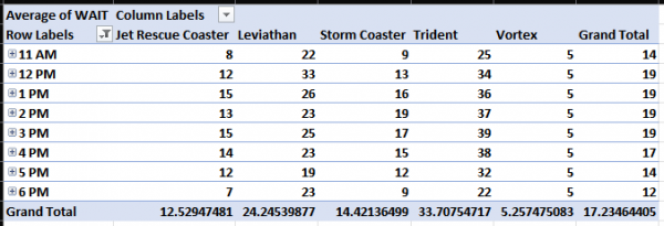
Nothing too much to note except for Leviathan seeing a huge spike at the start of every day. My assumption is that a lot of people are visiting the park but it's generally down at the start of the day. Therefore people hang out for longer than usual and a larger-than-average crowd forms because of it waiting for the ride to open. Also people really don't like Vortex.
If there is any data you want feel free to let me know. Again there are problems with this considering that it's only sampling every 15 minutes and we're relying off output from the park but it's still interesting none-the-less.
-
2
-
 1
1
-
-
I agree with the sentiment of what you're saying @Slick. A wave swinger in this placement is not ideal, but neither is Dreamworld's entire situation. They have to carefully balance profits and brand recovery. A big criticism I have for Dreamworld is that it's first impression once you walk through the gate is pretty bad. Sky Voyager sucked a lot of the charm out of Main Street and any kinetics that could recover the mood are hidden other behind structures (except for perhaps Claw but even then it's around a corner. Even during busy periods Main Street just has a tendency to feel lifeless and considering crowds play an important part in determining atmosphere I honestly think a bit of congestion will do wonders for the parks first impression.
Once it's up and running you'll be greeted to a much better first impression when entering the gates. You'll have the visual kinetics, happy groups of guests, gleeful sounds from the attraction, etc. Plus they then get the bonus of using it in the night markets which hopefully solves some of the lost revenue problems that you mentions.
In my opinion it's the best possible outcome for their entrance experience without completely redoing it.
-
I wish somebody could replace my baggage


Dreamworld Flyer
in Theme Park Discussion
Posted
Perspective is key. Wall is ugly, but its not important. First impressions are mostly digital now. A good majority of guests will gather their initial thoughts from things such as their online ticketing experience, cost, ease of use, or park and user generated content.
The important factor once guests are inside is whether they decide to come back. Dreamworld are missing out on a memory making opportunity and a 'wow' moment here but that's about it. The biggest factors for whether a guest returns remain as satisfaction and value. This ugly wall wouldn't even make a dint in those compared to other issues such as Giant Drop still being closed.